- Foundry:
- Fantasia Type
- Released:
- February 12, 2025
- Styles:
- 7
- Category:
- sans-serif
- Tone:
- weird
- Use size:
- large
- Width:
- normal
- Weight:
- light, bold
- Contrast:
- low
- Other:
- Download:
- ⤓ Trials⤓ End User License Agreement⤓ PDF Specimen
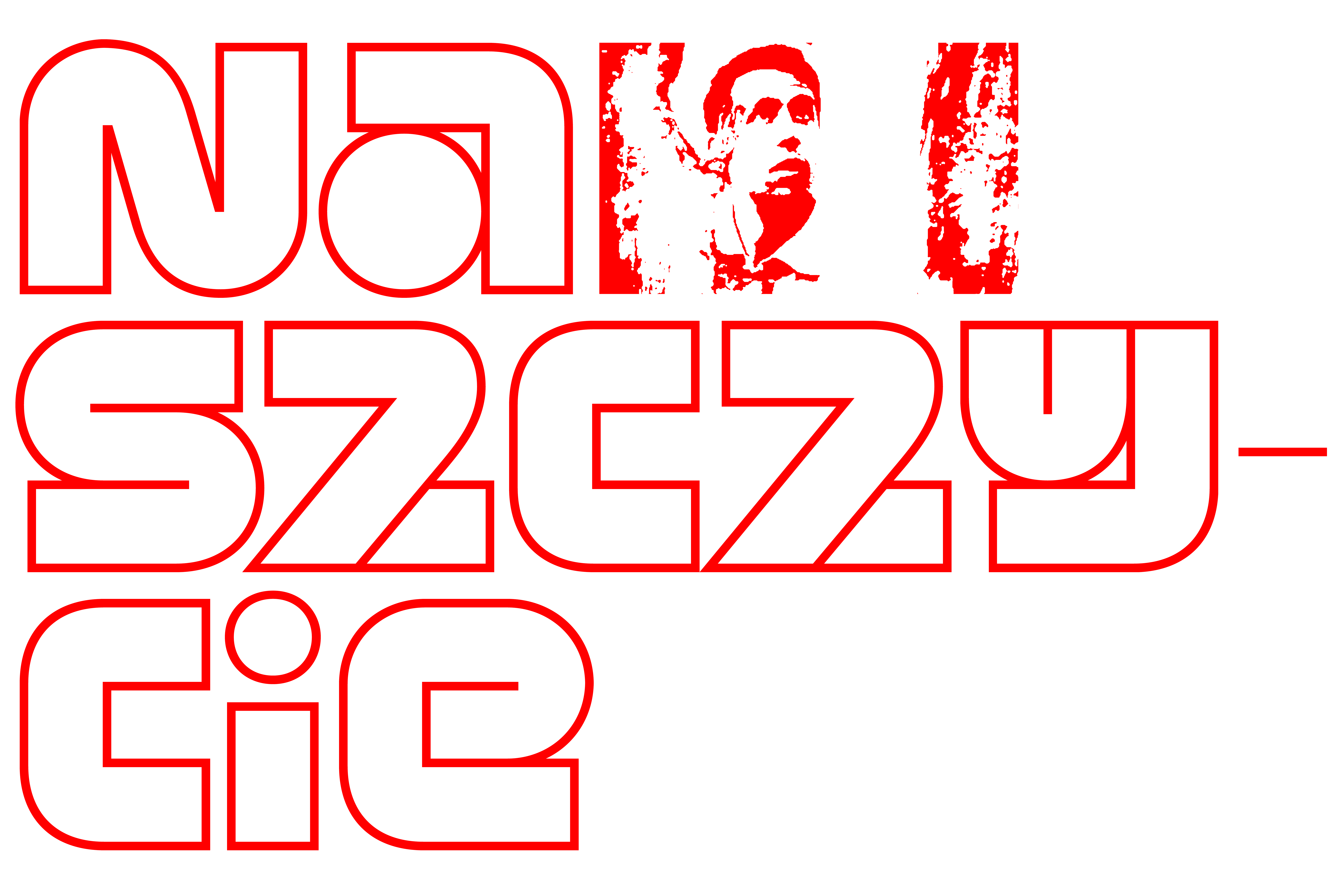
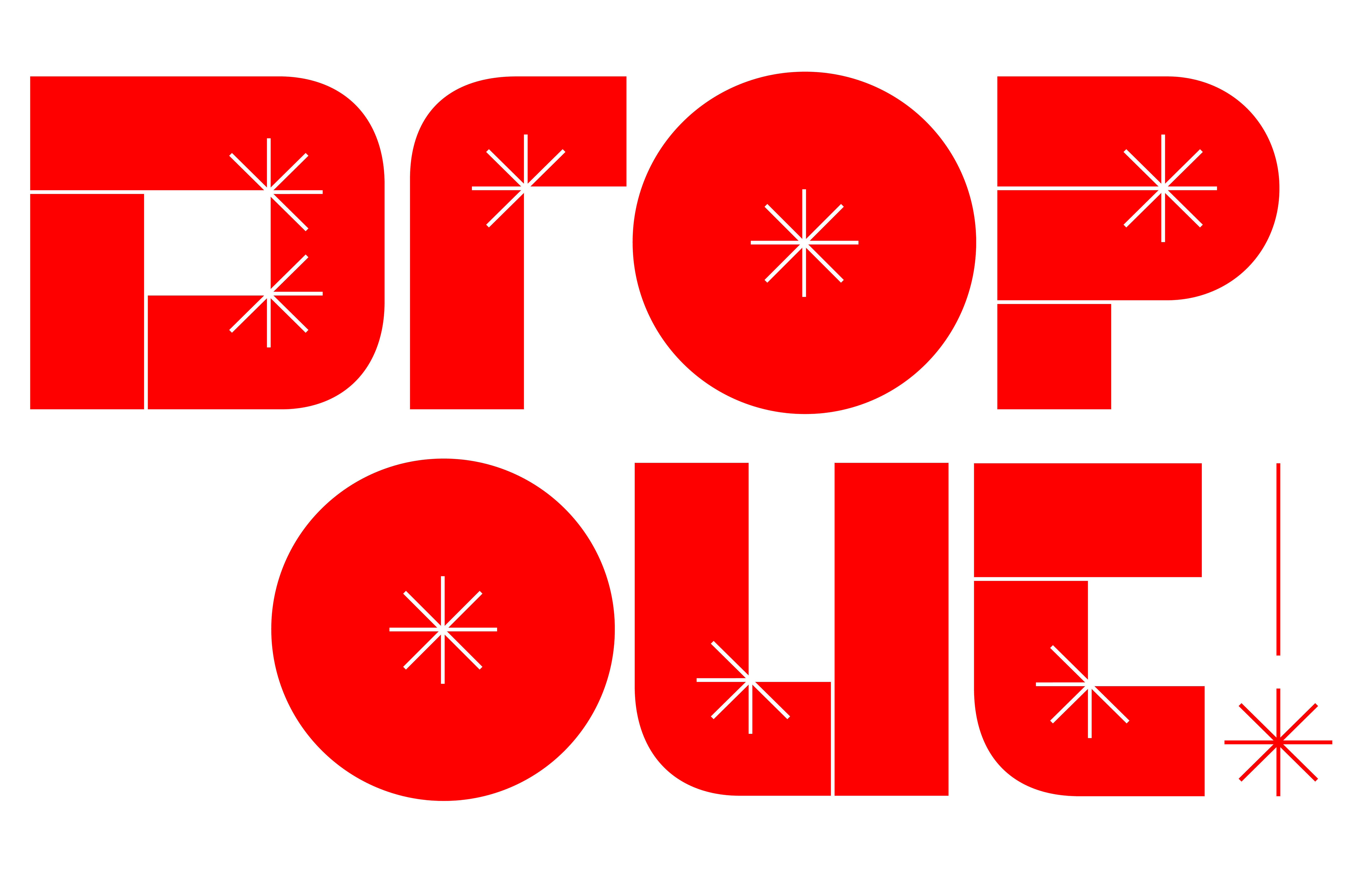
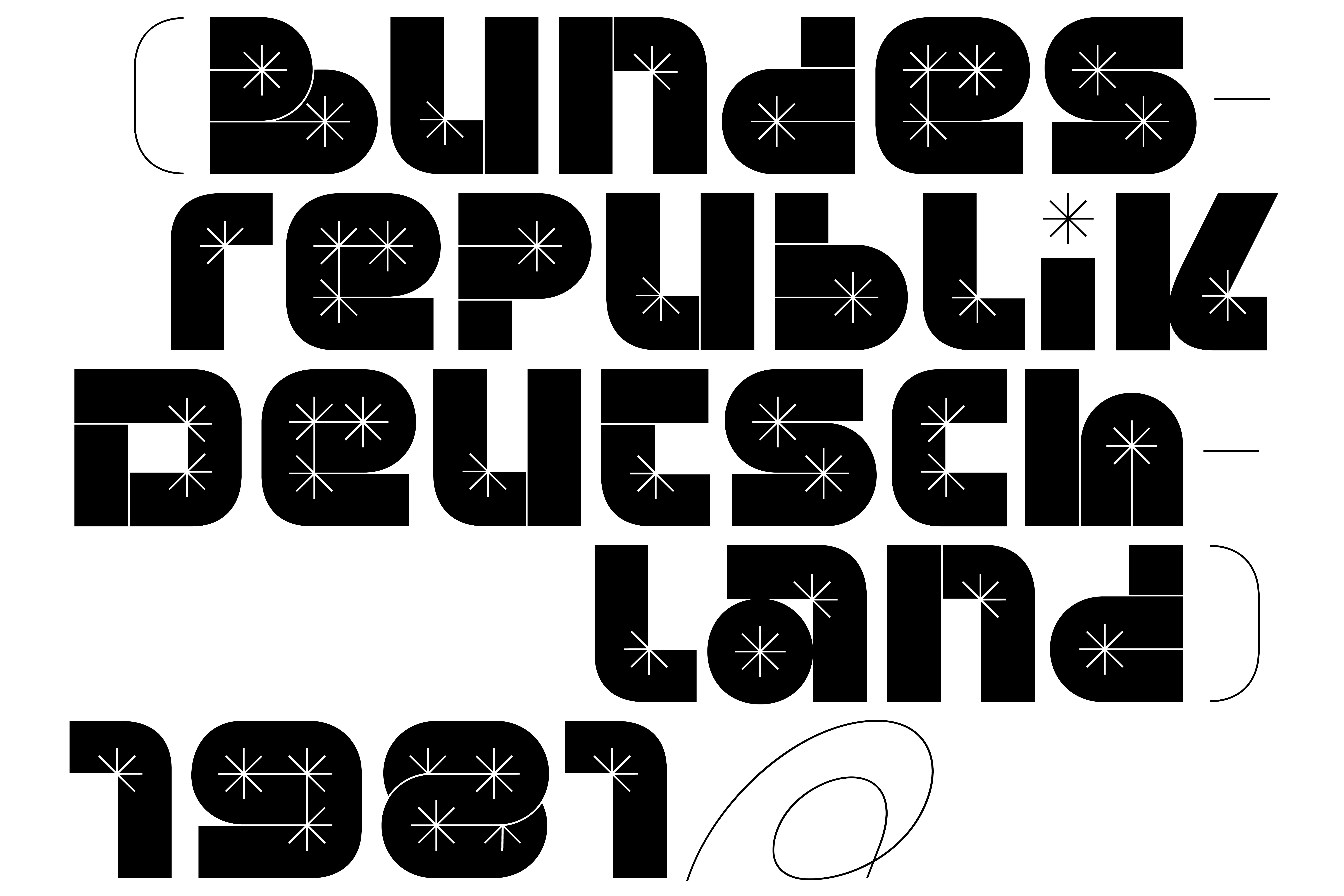
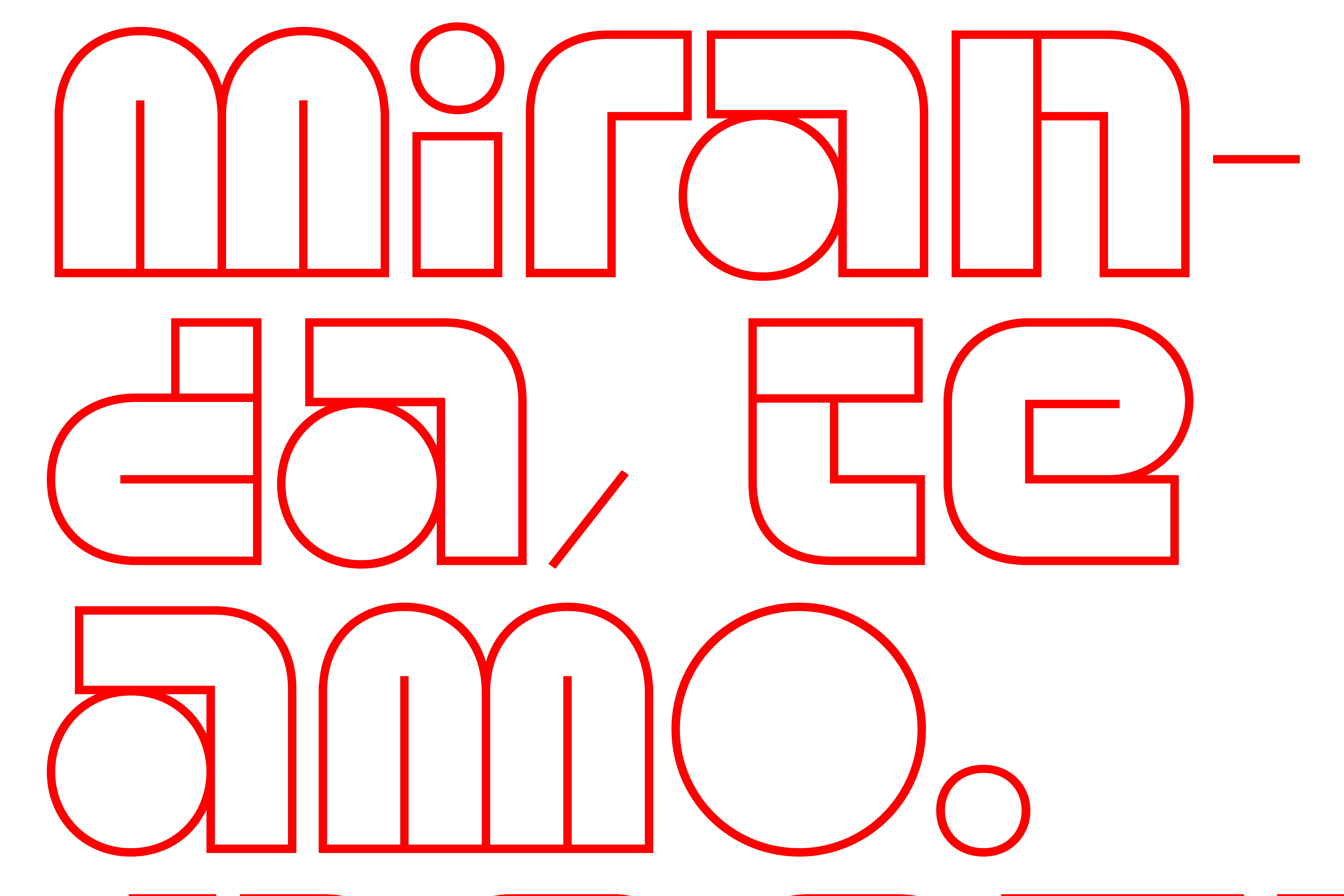
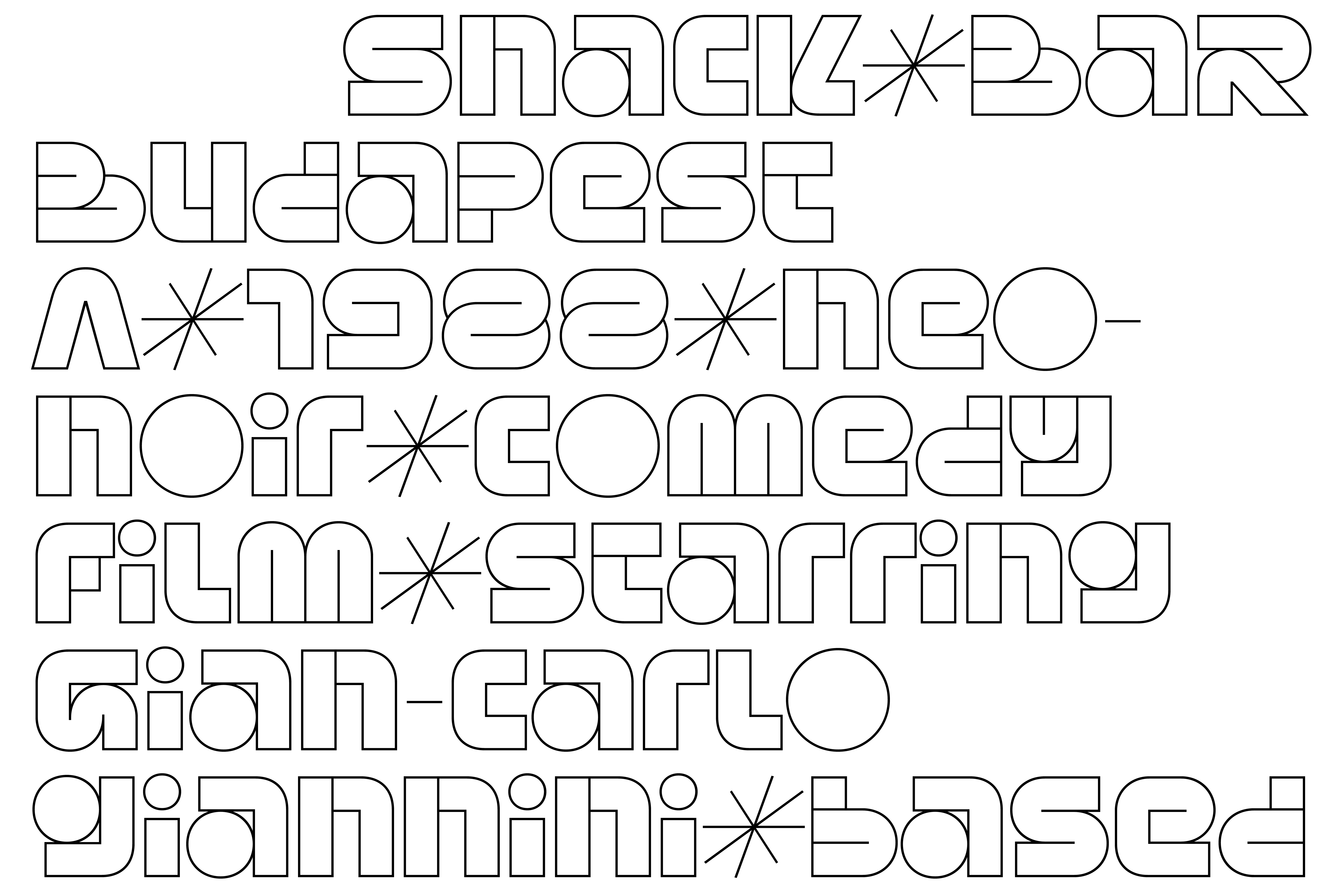
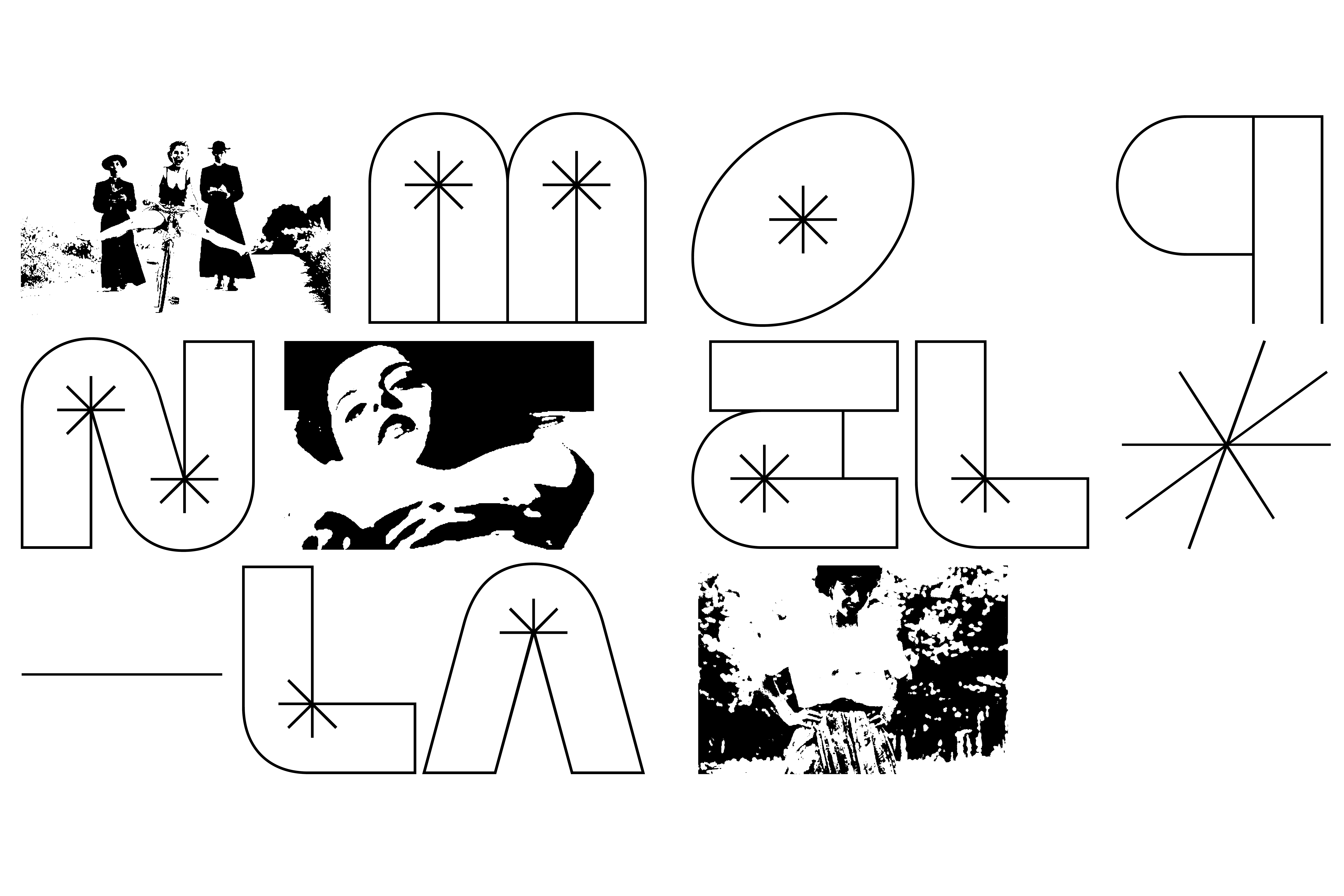
The BRASS display family consists of several members. There are two main sub-families: one with the “asterisk element”, in outline and “Filled” version, and the “Plain” exclusively in outline. Both outline versions are available in various stroke thicknesses.
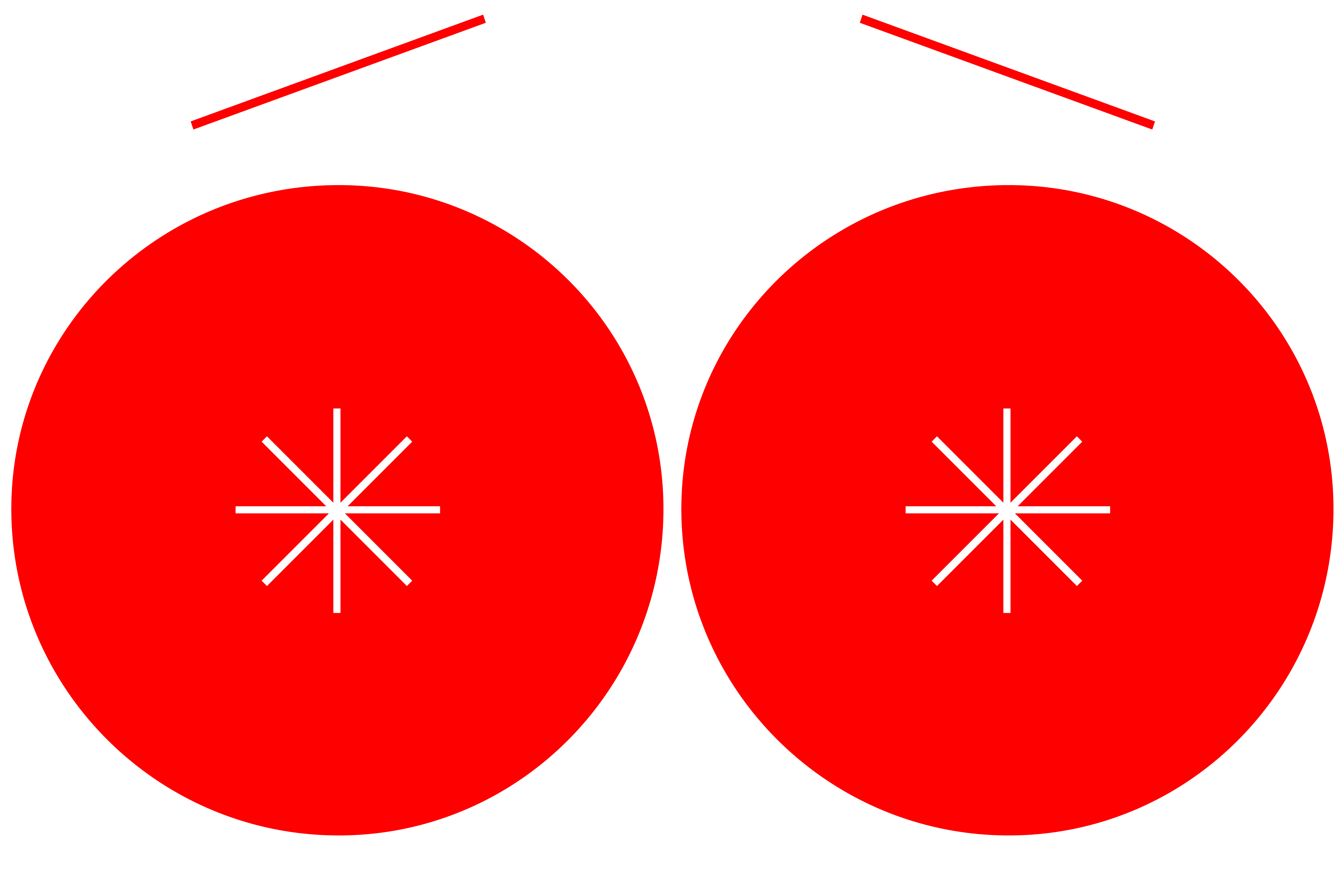
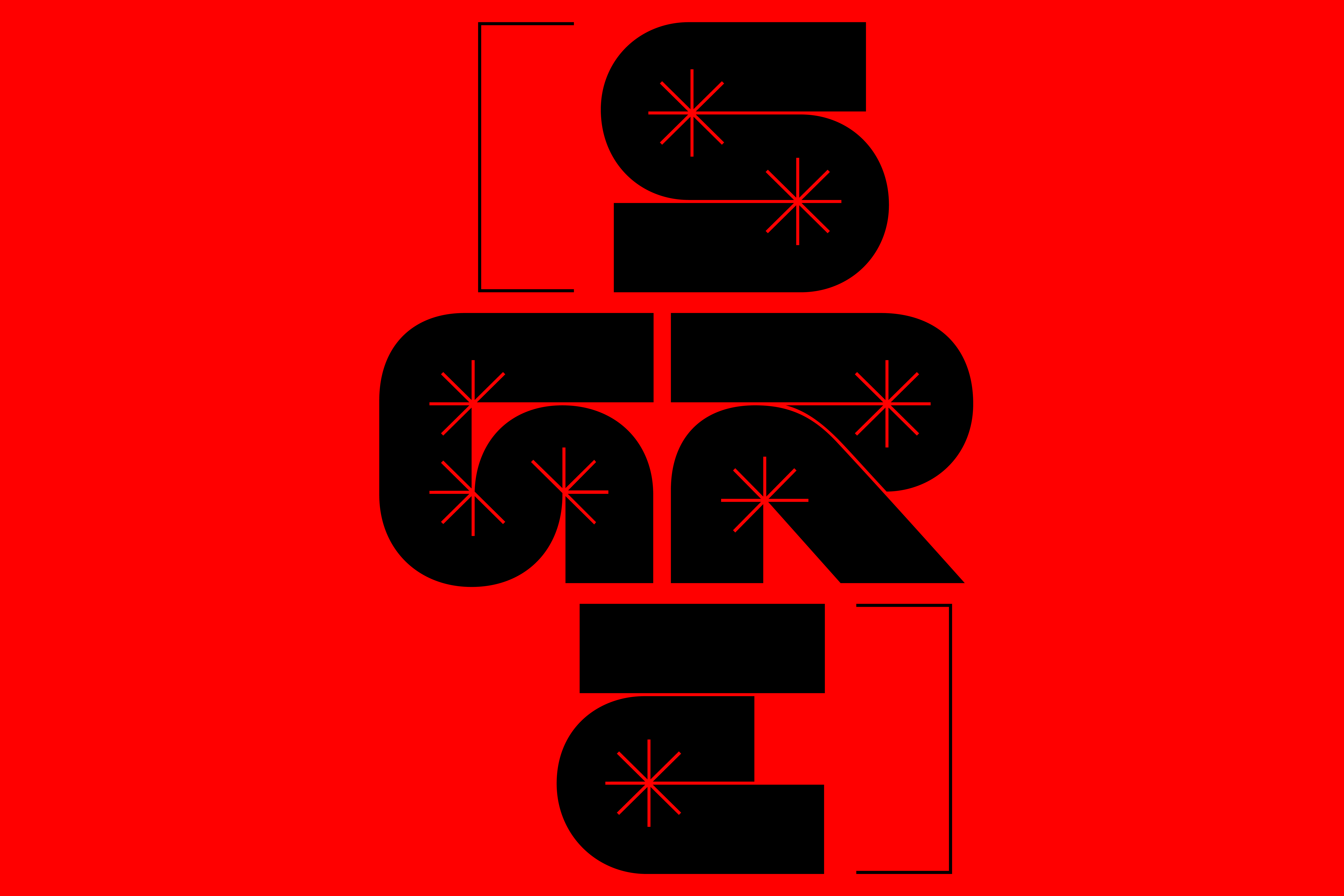
From a design and aesthetic point of view, the typeface is linked to various references from the history and practice of graphic design. The strokes that make up the letters are influenced by experiments done with Adobe Illustrator’s digital brushes. This is visible, for instance, in the “asterisk element” that connotes the typeface, a stylization of the glitches frequent when applying digital brushes to vector strokes. However, starting with its name, the typeface is intended to be a tribute to the artistic career of Italian director Tinto Brass. Brass’ cinema, in fact, in addition to his experiments on a formal level, in editing, photography, set design and costumes, as well as his contribution to the maturation of the erotic genre in Italy in particular, can also be analyzed for his constant dialogue with graphic design and typography.
Design: Franziska Weitgruber + Michele Galluzzo
Select a license
⤓ Read Fantasia Type’s EULASelect bundles
Select individual styles
Please select some licenses and styles
