- Foundry:
- Flight Mode
- Released:
- December 10, 2024
- Styles:
- 12
- Category:
- serif
- Tone:
- weird
- Use size:
- large, medium
- Width:
- normal
- Weight:
- light, regular, medium, bold
- Contrast:
- high, medium
- Other:
- variable, italic
- Download:
- ⤓ Trials⤓ End User License Agreement
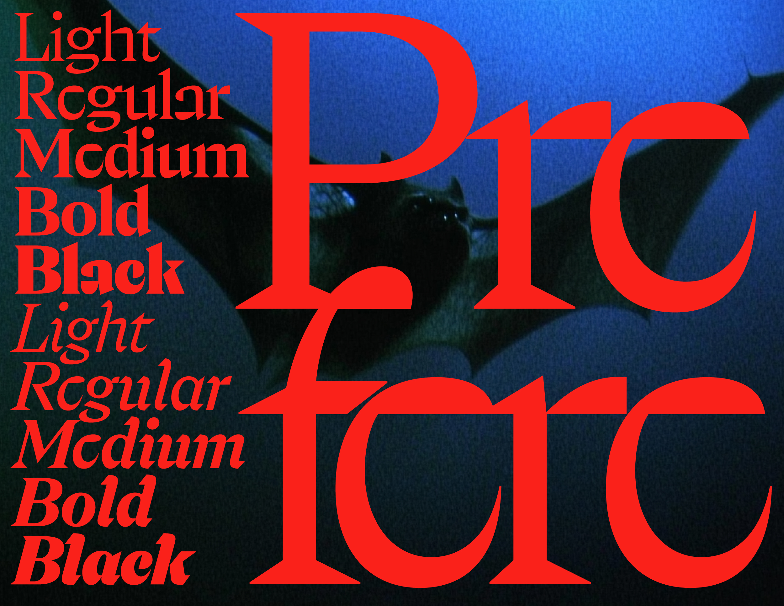
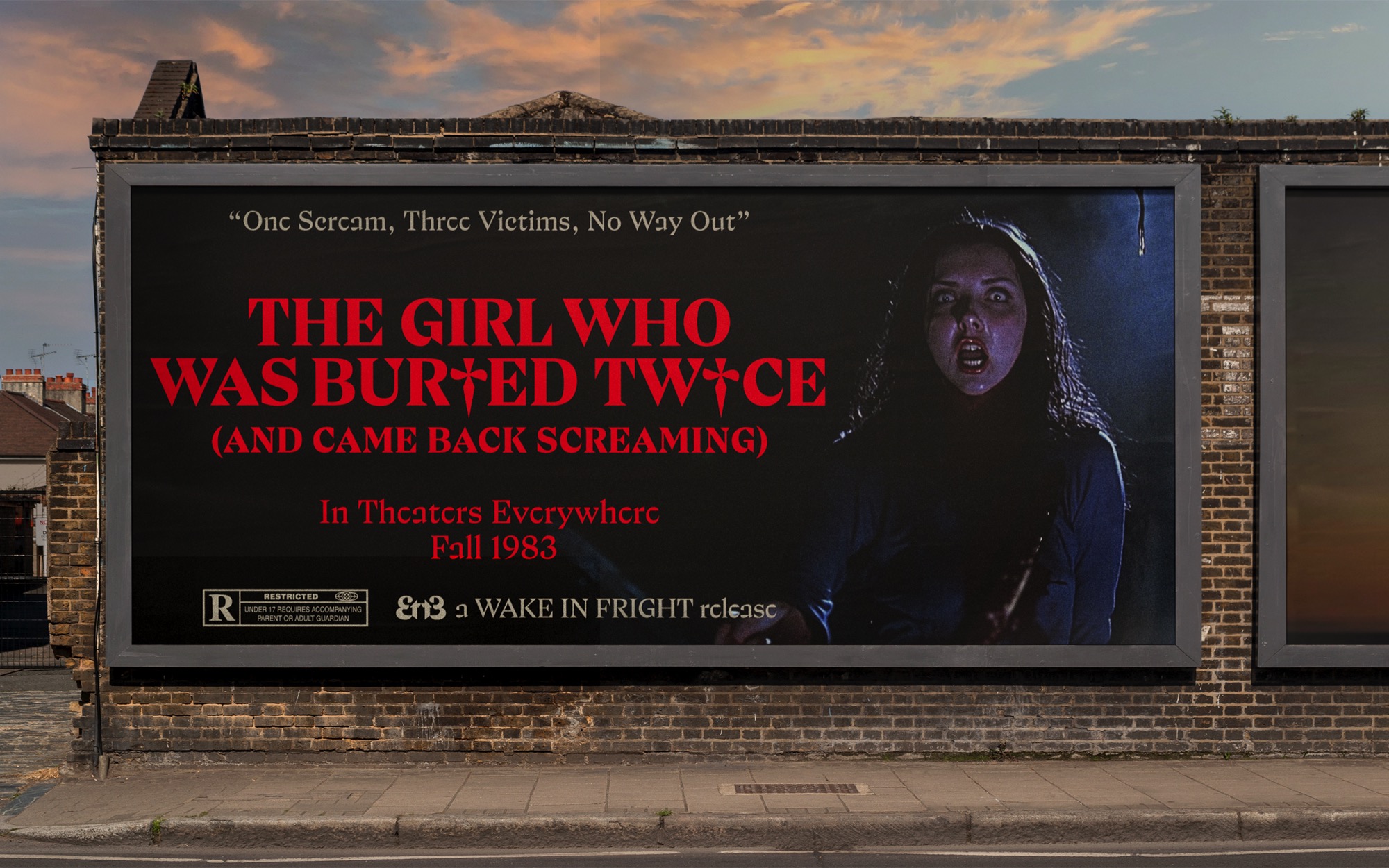
Prefere takes its deep historical roots in day 22 of running out of ideas in a challenge to make a quick font every day, back in 2021. “Hold the line” seemed silly enough. Forcing elements to align along an imaginary horizontal resulted in flat counters, brutal geometry and some blind letters. Edgy! Fast forward to 2025, it is now a complete type family, ready to raise some eyebrows.
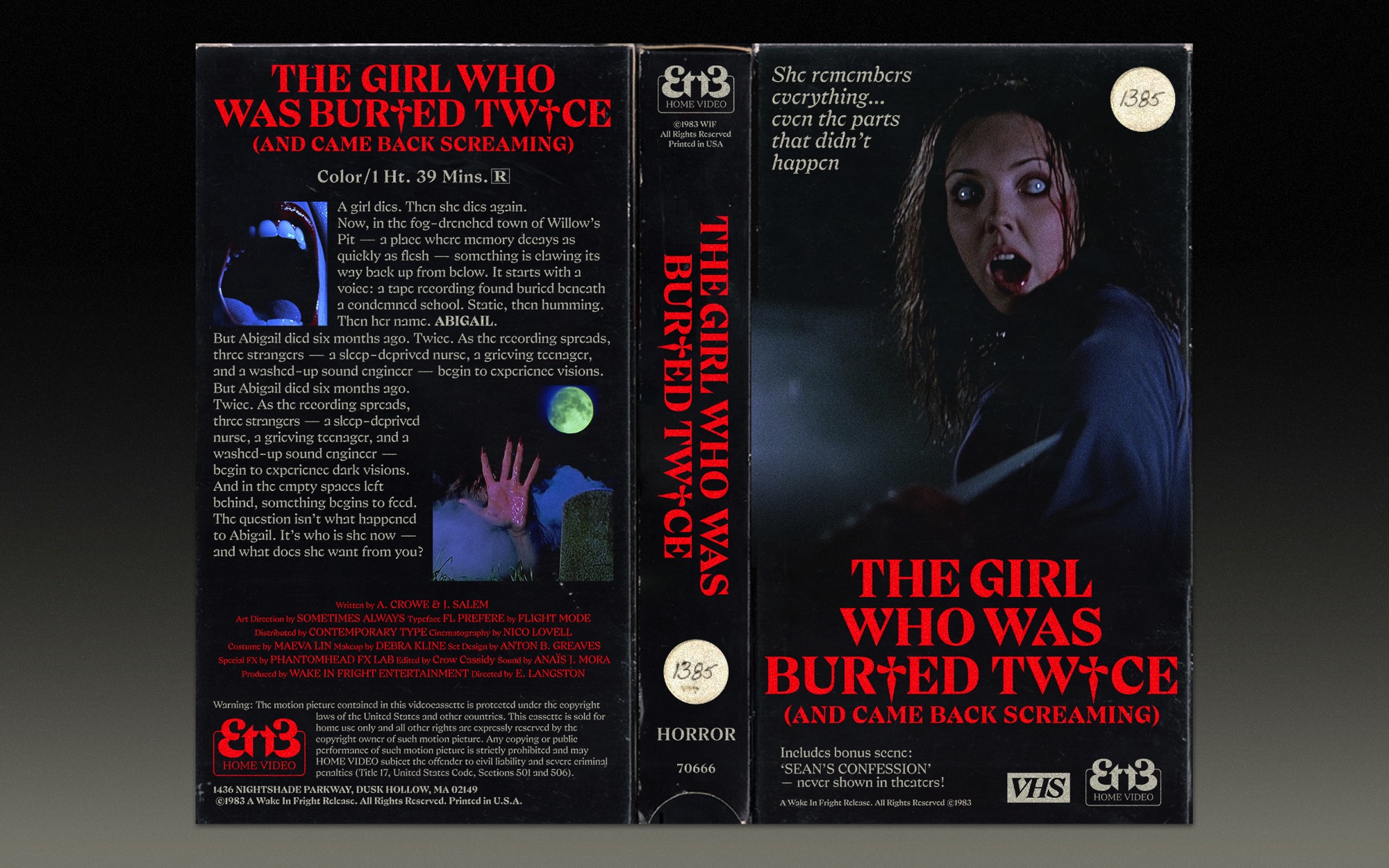
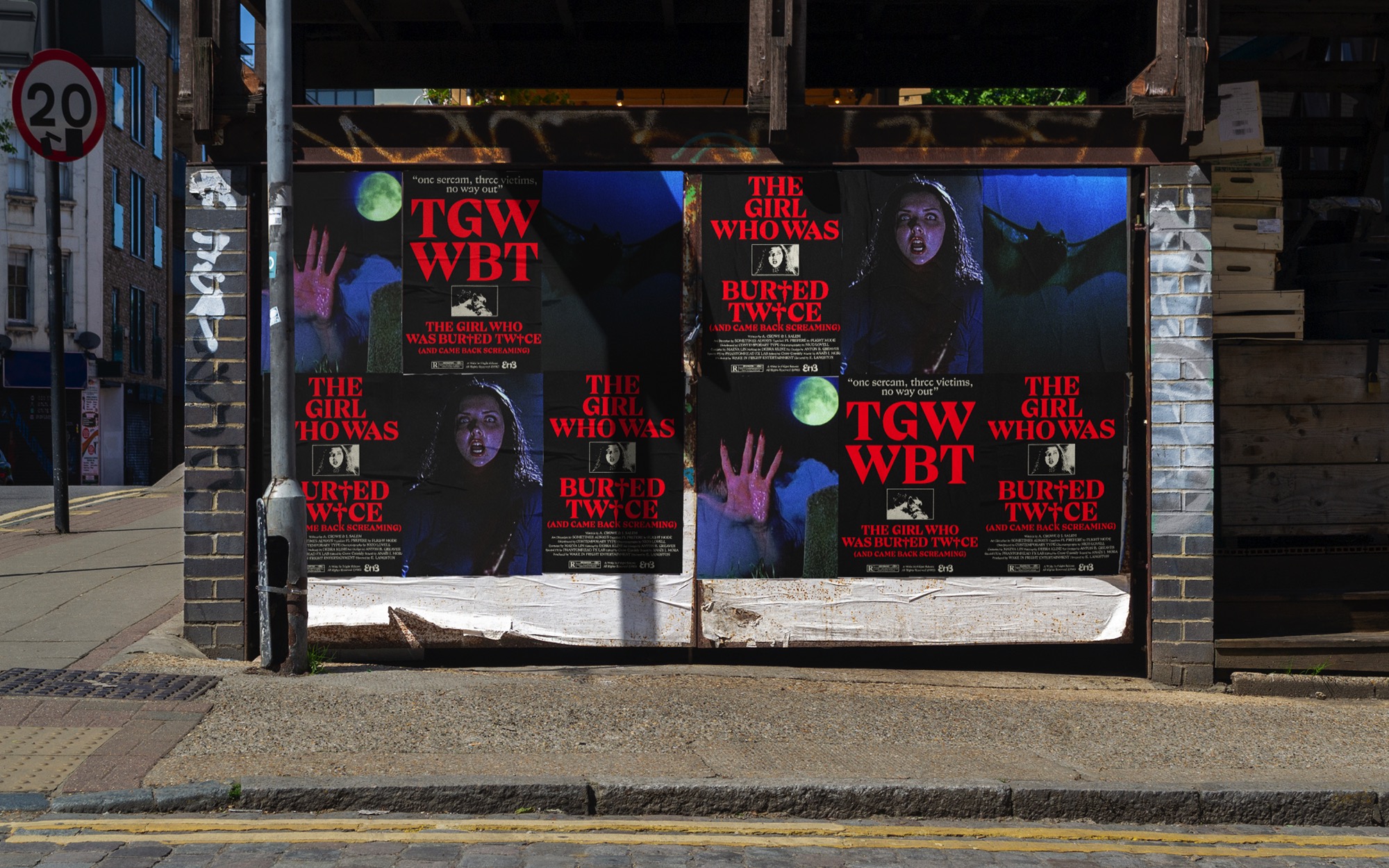
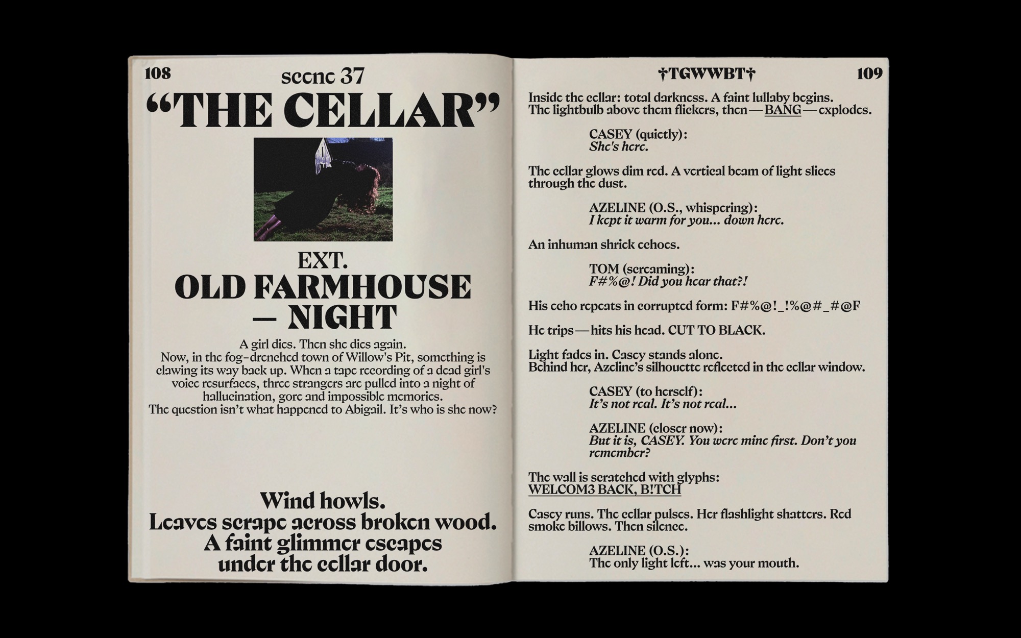
The typeface is, of course, meant for big-sizes: posters, headlines, websites, and so on — you know the drill. Loosen up its very tight letter spacing, and it can handle somewhat smaller texts too. The family comes in 5 weights and corresponding italics, which were especially fun to design.
The name Prefere comes from the extensive process of combining letters which align among the line. The rule number one is known: the typeface’s name must look good when set in itself. It is pronounced halfway between the English “prefer” and French “préférée”, with some doubt in the voice. Prefere was fun to design and I hope you’ll have fun using it.
Select a license
⤓ Read Flight Mode’s EULASelect bundles
Select individual styles
Please select some licenses and styles
