- Foundry:
- Flight Mode
- Released:
- February 15, 2025
- Styles:
- 62
- Category:
- sans-serif
- Tone:
- casual
- Use size:
- large, medium, small
- Width:
- normal
- Weight:
- light, regular, medium, bold
- Contrast:
- medium, low
- Other:
- variable, italic
- Download:
- ⤓ Trials⤓ End User License Agreement
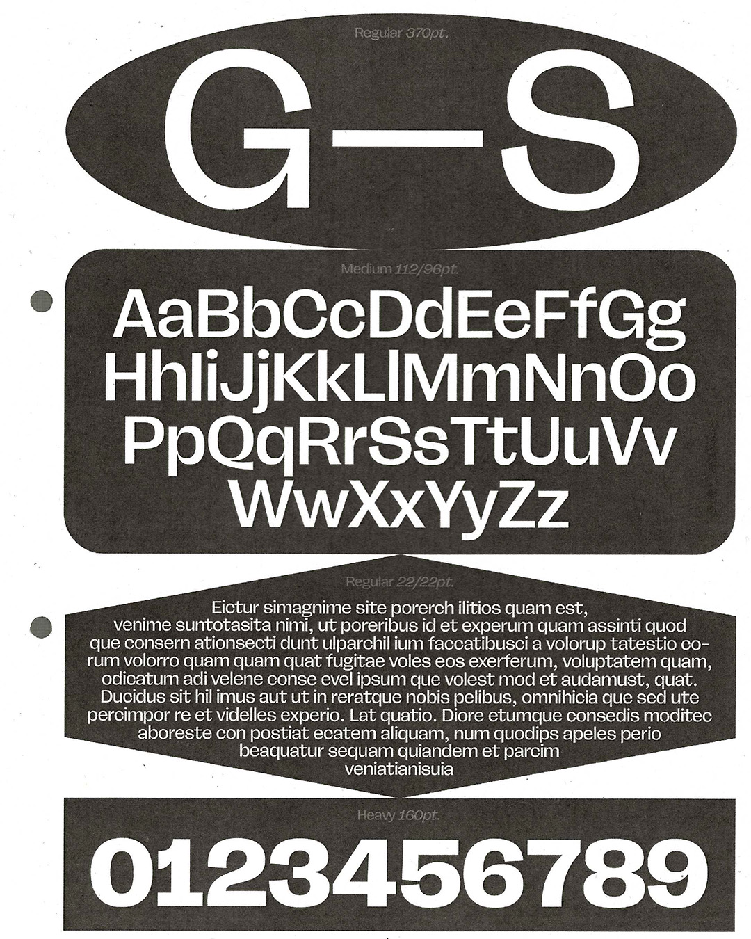
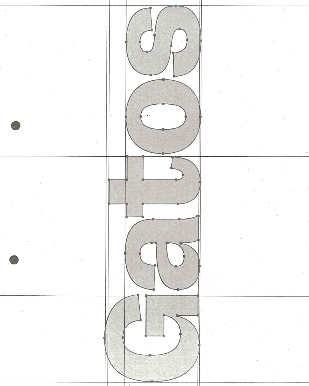
FL Rare is an efficient grotesk fused with traces of handwriting. Its clean shapes, closed apertures and low contrast place the typeface in the class of functional sans-serifs, but then it breaks from the expected with the subtle artifacts of pen movements and cursive cuts, uncommon for the genre. That eclectic approach provides both utility and flair, contemporary feel and readability.
The Cursive styles deepen the fusion further. Obvious for serif fonts, such true italics are seldom seen among grotesques, which, perhaps, makes FL Rare a surreal take on the idea of a “sans-serif cursive”. This part of the family is designed to widen the range of typographic expressions, while maintaining a consistent feel. The cursive letterforms closely resemble the upright counterparts, making them work together naturally. Sidenote: the term “cursive” is used loosely here. Naming is hard.
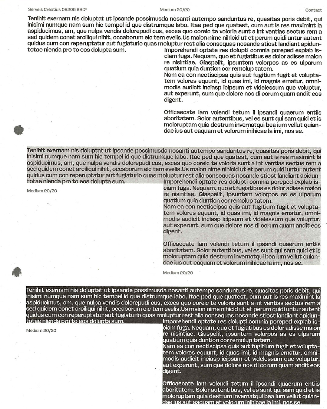
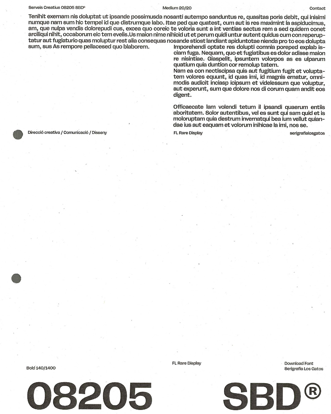
The family consists of 7 weights with corresponding 16° italics. It is tuned to work at different optical sizes, organized into 3 subfamilies. The Display subfamily is crisp, sharp and tightly spaced, ideal for high-impact use at large scales. The Text subfamily on the other end features more robust shapes, open apertures and loose spacing, making it comfortable to read at smaller sizes. For anything in-between, the Deck subfamily is the default choice. With its OpenType style sets, the typeface includes extra-legible alternatives for l and I, as well as single-story versions of a and g.
FL Rare comes with variable fonts corresponding to each bundle of styles, which allow to fine-tune the exact optical size, weight or italic angle, as well as to create animations or interactive transitions on the web. Cursive cuts form a separate variable font for now. FL Rare supports many Latin-based languages.
Select a license
⤓ Read Flight Mode’s EULASelect bundles
Select individual styles
Please select some licenses and styles
