'%3e%3crect%20x='45.5'%20y='27.5'%20rx='4.5'%20ry='4.5'%20width='9'%20height='9'%20fill='%23929292'%3e%3canimate%20attributeName='opacity'%20values='1;0'%20keyTimes='0;1'%20dur='0.9615384615384615s'%20begin='-0.8547008547008548s'%20repeatCount='indefinite'%3e%3c/animate%3e%3c/rect%3e%3c/g%3e%3cg%20transform='rotate(40%2050%2050)'%3e%3crect%20x='45.5'%20y='27.5'%20rx='4.5'%20ry='4.5'%20width='9'%20height='9'%20fill='%23929292'%3e%3canimate%20attributeName='opacity'%20values='1;0'%20keyTimes='0;1'%20dur='0.9615384615384615s'%20begin='-0.7478632478632479s'%20repeatCount='indefinite'%3e%3c/animate%3e%3c/rect%3e%3c/g%3e%3cg%20transform='rotate(80%2050%2050)'%3e%3crect%20x='45.5'%20y='27.5'%20rx='4.5'%20ry='4.5'%20width='9'%20height='9'%20fill='%23929292'%3e%3canimate%20attributeName='opacity'%20values='1;0'%20keyTimes='0;1'%20dur='0.9615384615384615s'%20begin='-0.6410256410256411s'%20repeatCount='indefinite'%3e%3c/animate%3e%3c/rect%3e%3c/g%3e%3cg%20transform='rotate(120%2050%2050)'%3e%3crect%20x='45.5'%20y='27.5'%20rx='4.5'%20ry='4.5'%20width='9'%20height='9'%20fill='%23929292'%3e%3canimate%20attributeName='opacity'%20values='1;0'%20keyTimes='0;1'%20dur='0.9615384615384615s'%20begin='-0.5341880341880342s'%20repeatCount='indefinite'%3e%3c/animate%3e%3c/rect%3e%3c/g%3e%3cg%20transform='rotate(160%2050%2050)'%3e%3crect%20x='45.5'%20y='27.5'%20rx='4.5'%20ry='4.5'%20width='9'%20height='9'%20fill='%23929292'%3e%3canimate%20attributeName='opacity'%20values='1;0'%20keyTimes='0;1'%20dur='0.9615384615384615s'%20begin='-0.4273504273504274s'%20repeatCount='indefinite'%3e%3c/animate%3e%3c/rect%3e%3c/g%3e%3cg%20transform='rotate(200%2050%2050)'%3e%3crect%20x='45.5'%20y='27.5'%20rx='4.5'%20ry='4.5'%20width='9'%20height='9'%20fill='%23929292'%3e%3canimate%20attributeName='opacity'%20values='1;0'%20keyTimes='0;1'%20dur='0.9615384615384615s'%20begin='-0.32051282051282054s'%20repeatCount='indefinite'%3e%3c/animate%3e%3c/rect%3e%3c/g%3e%3cg%20transform='rotate(240%2050%2050)'%3e%3crect%20x='45.5'%20y='27.5'%20rx='4.5'%20ry='4.5'%20width='9'%20height='9'%20fill='%23929292'%3e%3canimate%20attributeName='opacity'%20values='1;0'%20keyTimes='0;1'%20dur='0.9615384615384615s'%20begin='-0.2136752136752137s'%20repeatCount='indefinite'%3e%3c/animate%3e%3c/rect%3e%3c/g%3e%3cg%20transform='rotate(280%2050%2050)'%3e%3crect%20x='45.5'%20y='27.5'%20rx='4.5'%20ry='4.5'%20width='9'%20height='9'%20fill='%23929292'%3e%3canimate%20attributeName='opacity'%20values='1;0'%20keyTimes='0;1'%20dur='0.9615384615384615s'%20begin='-0.10683760683760685s'%20repeatCount='indefinite'%3e%3c/animate%3e%3c/rect%3e%3c/g%3e%3cg%20transform='rotate(320%2050%2050)'%3e%3crect%20x='45.5'%20y='27.5'%20rx='4.5'%20ry='4.5'%20width='9'%20height='9'%20fill='%23929292'%3e%3canimate%20attributeName='opacity'%20values='1;0'%20keyTimes='0;1'%20dur='0.9615384615384615s'%20begin='0s'%20repeatCount='indefinite'%3e%3c/animate%3e%3c/rect%3e%3c/g%3e%3c!--%20[ldio]%20generated%20by%20https://loading.io/%20--%3e%3c/svg%3e)
- Foundry:
- Rüdiger
- Released:
- February 24, 2025
- Styles:
- 6
- Category:
- sans-serif
- Tone:
- casual
- Use size:
- large
- Width:
- normal
- Weight:
- light
- Contrast:
- low
- Other:
- rounded
- Download:
- ⤓ Trials⤓ End User License Agreement⤓ PDF Specimen
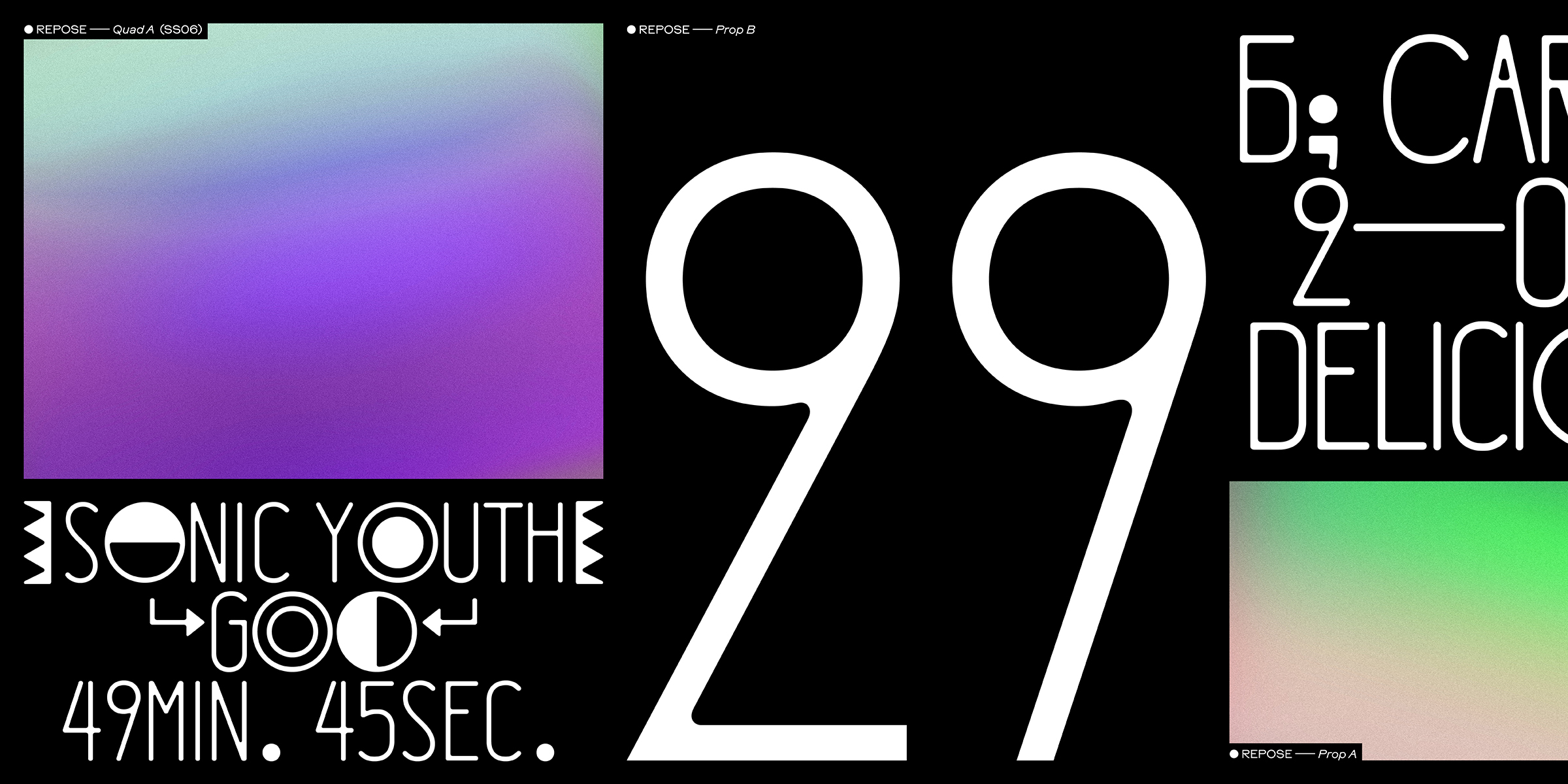
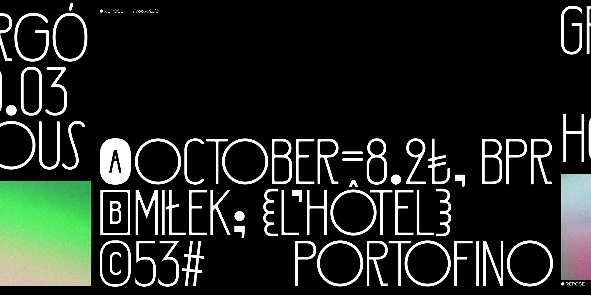
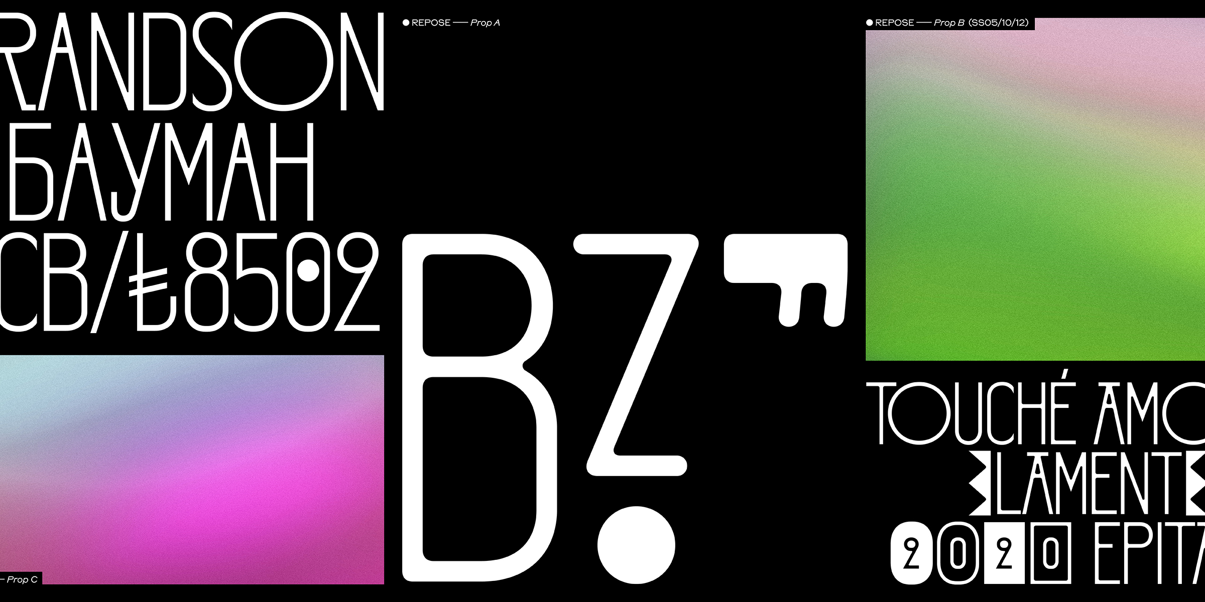
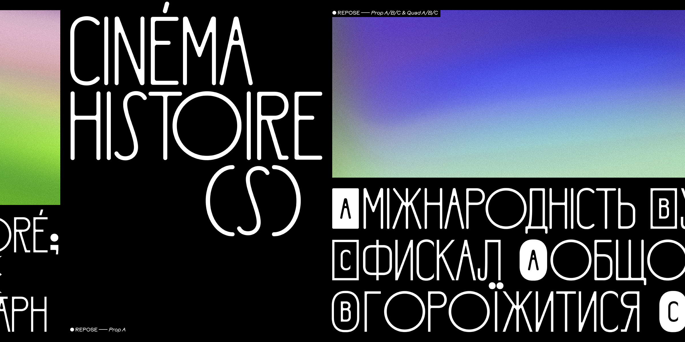
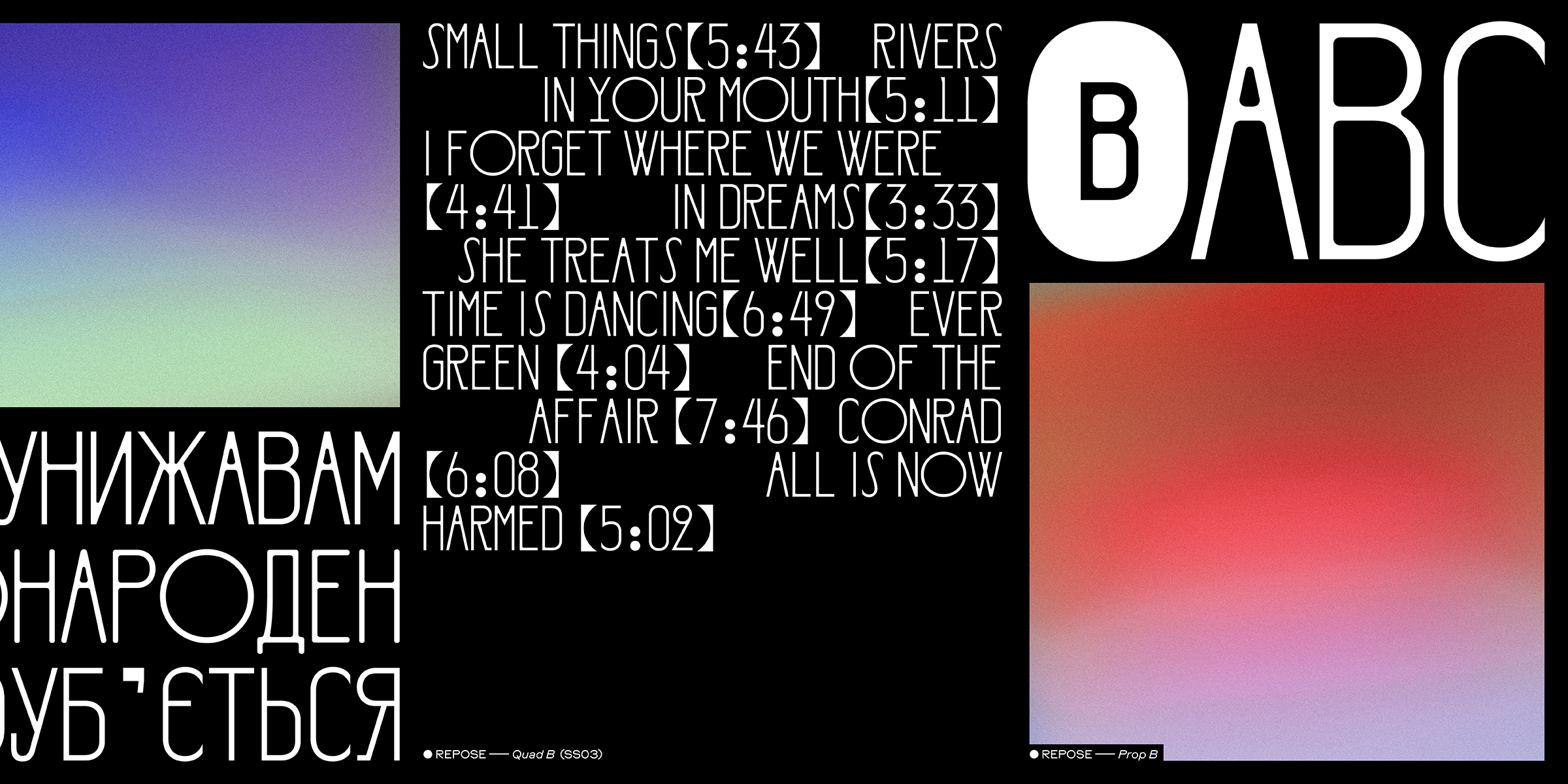
Repose is a Venn diagram of dynamic proportions and technical restraint in one beautiful sans-serif composition. Repose is a simple but complex sounding collection of six variations of a single uppercase-only light weight. The differences between these variations are subtle yet powerful. While roundness decreases incrementally from everywhere to nowhere in three styles, two distinct spacing approaches will give you more options or chaos to embrace. Whatever suits you. Though Repose’s general proportions are expressively dynamic, they stem from a structured foundation; the combination of four fixed widths. “O” doubles “H” doubles “I”. The first sub-collection follows the previously mentioned spacing approach and is called “Quad”. Much like a Monospace, this “Quadrospace” — if you will, because I do — forgoes kerning in favour of simplicity and a technical awkwardness that exudes undeniable charm. But, you know … with MORE fun. The second, more conventional spacing approach is called “Prop”. It maintains the same dynamic proportions but with minor adjustments and one magical ingredient; kerning! This allows for tight typesetting and the creation of a modest elegance. Both sub-collections come in three styles: “A” features roundings on all edges. “B” applies roundings sparingly, only on inside corners. And “C” disregards them entirely and strolls proudly bald through the typographical landscapes. Repose demands to be used big and ostentatiously. There’s no need for restraint — show them what you’ve got! Whether it’s big movie titles, spread out on record covers, building-sized banners, or haughty headlines, Repose has you covered. To maximize its limited range, REPOSE is packed to the gills with features! This 630+ glyph powerhouse supports more than 280 languages in both Cyrillic and Latin scripts. It offers a wide range of stylistic sets for alternative letterforms, six sets of brackets(!), an assortment of arrows and symbols, black- and white-circled figures as well as squared alternatives, and smart contextual alternates that do the heavy lifting for you. You want to have some fun — what are you waiting for? ↳ In case you are in need of a license-kind that is not listed below or a custom solution, please get in contact with us via email.
Select a license
⤓ Read Rüdiger’s EULASelect bundles
Select individual styles
Please select some licenses and styles