'%3e%3crect%20x='45.5'%20y='27.5'%20rx='4.5'%20ry='4.5'%20width='9'%20height='9'%20fill='%23929292'%3e%3canimate%20attributeName='opacity'%20values='1;0'%20keyTimes='0;1'%20dur='0.9615384615384615s'%20begin='-0.8547008547008548s'%20repeatCount='indefinite'%3e%3c/animate%3e%3c/rect%3e%3c/g%3e%3cg%20transform='rotate(40%2050%2050)'%3e%3crect%20x='45.5'%20y='27.5'%20rx='4.5'%20ry='4.5'%20width='9'%20height='9'%20fill='%23929292'%3e%3canimate%20attributeName='opacity'%20values='1;0'%20keyTimes='0;1'%20dur='0.9615384615384615s'%20begin='-0.7478632478632479s'%20repeatCount='indefinite'%3e%3c/animate%3e%3c/rect%3e%3c/g%3e%3cg%20transform='rotate(80%2050%2050)'%3e%3crect%20x='45.5'%20y='27.5'%20rx='4.5'%20ry='4.5'%20width='9'%20height='9'%20fill='%23929292'%3e%3canimate%20attributeName='opacity'%20values='1;0'%20keyTimes='0;1'%20dur='0.9615384615384615s'%20begin='-0.6410256410256411s'%20repeatCount='indefinite'%3e%3c/animate%3e%3c/rect%3e%3c/g%3e%3cg%20transform='rotate(120%2050%2050)'%3e%3crect%20x='45.5'%20y='27.5'%20rx='4.5'%20ry='4.5'%20width='9'%20height='9'%20fill='%23929292'%3e%3canimate%20attributeName='opacity'%20values='1;0'%20keyTimes='0;1'%20dur='0.9615384615384615s'%20begin='-0.5341880341880342s'%20repeatCount='indefinite'%3e%3c/animate%3e%3c/rect%3e%3c/g%3e%3cg%20transform='rotate(160%2050%2050)'%3e%3crect%20x='45.5'%20y='27.5'%20rx='4.5'%20ry='4.5'%20width='9'%20height='9'%20fill='%23929292'%3e%3canimate%20attributeName='opacity'%20values='1;0'%20keyTimes='0;1'%20dur='0.9615384615384615s'%20begin='-0.4273504273504274s'%20repeatCount='indefinite'%3e%3c/animate%3e%3c/rect%3e%3c/g%3e%3cg%20transform='rotate(200%2050%2050)'%3e%3crect%20x='45.5'%20y='27.5'%20rx='4.5'%20ry='4.5'%20width='9'%20height='9'%20fill='%23929292'%3e%3canimate%20attributeName='opacity'%20values='1;0'%20keyTimes='0;1'%20dur='0.9615384615384615s'%20begin='-0.32051282051282054s'%20repeatCount='indefinite'%3e%3c/animate%3e%3c/rect%3e%3c/g%3e%3cg%20transform='rotate(240%2050%2050)'%3e%3crect%20x='45.5'%20y='27.5'%20rx='4.5'%20ry='4.5'%20width='9'%20height='9'%20fill='%23929292'%3e%3canimate%20attributeName='opacity'%20values='1;0'%20keyTimes='0;1'%20dur='0.9615384615384615s'%20begin='-0.2136752136752137s'%20repeatCount='indefinite'%3e%3c/animate%3e%3c/rect%3e%3c/g%3e%3cg%20transform='rotate(280%2050%2050)'%3e%3crect%20x='45.5'%20y='27.5'%20rx='4.5'%20ry='4.5'%20width='9'%20height='9'%20fill='%23929292'%3e%3canimate%20attributeName='opacity'%20values='1;0'%20keyTimes='0;1'%20dur='0.9615384615384615s'%20begin='-0.10683760683760685s'%20repeatCount='indefinite'%3e%3c/animate%3e%3c/rect%3e%3c/g%3e%3cg%20transform='rotate(320%2050%2050)'%3e%3crect%20x='45.5'%20y='27.5'%20rx='4.5'%20ry='4.5'%20width='9'%20height='9'%20fill='%23929292'%3e%3canimate%20attributeName='opacity'%20values='1;0'%20keyTimes='0;1'%20dur='0.9615384615384615s'%20begin='0s'%20repeatCount='indefinite'%3e%3c/animate%3e%3c/rect%3e%3c/g%3e%3c!--%20[ldio]%20generated%20by%20https://loading.io/%20--%3e%3c/svg%3e)

- Foundry:
- Typeji
- Released:
- May 23, 2026
- Styles:
- 3
- Category:
- sans-serif
- Tone:
- casual
- Use size:
- large
- Width:
- normal
- Weight:
- bold
- Contrast:
- low
- Other:
- variable, italic
- Download:
- ⤓ Trials⤓ End User License Agreement⤓ PDF Specimen
Stranger began as a lettering sketch in 2017, then developed into an early font version in 2019. It remained unpublished for years before being thoroughly redrawn and expanded into its current release. It is also the typeface behind the Typeji logo, so in a way, Stranger has long been part of the studio.
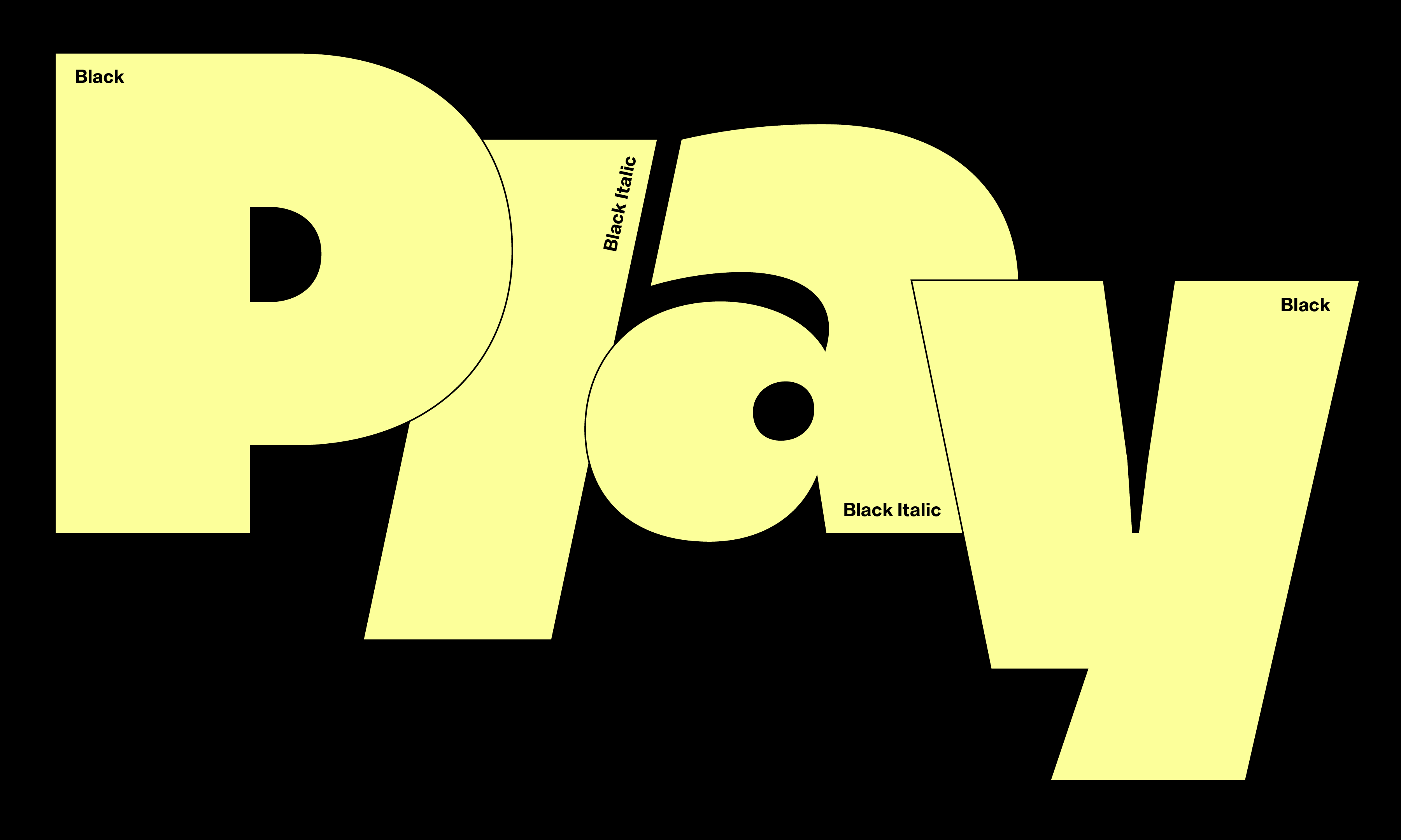
Stranger has an ultra-black display presence that feels both dense and playful. Its texture comes from the contrast between heavy outer strokes and finer inner lines, a structure that gives the design weight without making it feel blunt. Small circular dots and accent marks, loosely inspired by Gill Kayo, bring a friendly note to its otherwise solid forms. That rounded quality also appears in the counters of letters like ‘a’ and ‘&’, softening the overall impression further.
Although Stranger is playful in tone, its terminals are cut in a clean and steady way throughout: horizontal and vertical in the roman, and parallel to the angle in the italic. This helps the design stay stable and clear despite its weight, making it especially well suited for wordmarks.
Stranger now spans roman and italic styles, along with a variable font that moves between them, as well as broader language support including Vietnamese and Taiwanese Romanization.
Select a license
⤓ Read Typeji’s EULASelect bundles
Select individual styles
Please select some licenses and styles