'%3e%3crect%20x='45.5'%20y='27.5'%20rx='4.5'%20ry='4.5'%20width='9'%20height='9'%20fill='%23929292'%3e%3canimate%20attributeName='opacity'%20values='1;0'%20keyTimes='0;1'%20dur='0.9615384615384615s'%20begin='-0.8547008547008548s'%20repeatCount='indefinite'%3e%3c/animate%3e%3c/rect%3e%3c/g%3e%3cg%20transform='rotate(40%2050%2050)'%3e%3crect%20x='45.5'%20y='27.5'%20rx='4.5'%20ry='4.5'%20width='9'%20height='9'%20fill='%23929292'%3e%3canimate%20attributeName='opacity'%20values='1;0'%20keyTimes='0;1'%20dur='0.9615384615384615s'%20begin='-0.7478632478632479s'%20repeatCount='indefinite'%3e%3c/animate%3e%3c/rect%3e%3c/g%3e%3cg%20transform='rotate(80%2050%2050)'%3e%3crect%20x='45.5'%20y='27.5'%20rx='4.5'%20ry='4.5'%20width='9'%20height='9'%20fill='%23929292'%3e%3canimate%20attributeName='opacity'%20values='1;0'%20keyTimes='0;1'%20dur='0.9615384615384615s'%20begin='-0.6410256410256411s'%20repeatCount='indefinite'%3e%3c/animate%3e%3c/rect%3e%3c/g%3e%3cg%20transform='rotate(120%2050%2050)'%3e%3crect%20x='45.5'%20y='27.5'%20rx='4.5'%20ry='4.5'%20width='9'%20height='9'%20fill='%23929292'%3e%3canimate%20attributeName='opacity'%20values='1;0'%20keyTimes='0;1'%20dur='0.9615384615384615s'%20begin='-0.5341880341880342s'%20repeatCount='indefinite'%3e%3c/animate%3e%3c/rect%3e%3c/g%3e%3cg%20transform='rotate(160%2050%2050)'%3e%3crect%20x='45.5'%20y='27.5'%20rx='4.5'%20ry='4.5'%20width='9'%20height='9'%20fill='%23929292'%3e%3canimate%20attributeName='opacity'%20values='1;0'%20keyTimes='0;1'%20dur='0.9615384615384615s'%20begin='-0.4273504273504274s'%20repeatCount='indefinite'%3e%3c/animate%3e%3c/rect%3e%3c/g%3e%3cg%20transform='rotate(200%2050%2050)'%3e%3crect%20x='45.5'%20y='27.5'%20rx='4.5'%20ry='4.5'%20width='9'%20height='9'%20fill='%23929292'%3e%3canimate%20attributeName='opacity'%20values='1;0'%20keyTimes='0;1'%20dur='0.9615384615384615s'%20begin='-0.32051282051282054s'%20repeatCount='indefinite'%3e%3c/animate%3e%3c/rect%3e%3c/g%3e%3cg%20transform='rotate(240%2050%2050)'%3e%3crect%20x='45.5'%20y='27.5'%20rx='4.5'%20ry='4.5'%20width='9'%20height='9'%20fill='%23929292'%3e%3canimate%20attributeName='opacity'%20values='1;0'%20keyTimes='0;1'%20dur='0.9615384615384615s'%20begin='-0.2136752136752137s'%20repeatCount='indefinite'%3e%3c/animate%3e%3c/rect%3e%3c/g%3e%3cg%20transform='rotate(280%2050%2050)'%3e%3crect%20x='45.5'%20y='27.5'%20rx='4.5'%20ry='4.5'%20width='9'%20height='9'%20fill='%23929292'%3e%3canimate%20attributeName='opacity'%20values='1;0'%20keyTimes='0;1'%20dur='0.9615384615384615s'%20begin='-0.10683760683760685s'%20repeatCount='indefinite'%3e%3c/animate%3e%3c/rect%3e%3c/g%3e%3cg%20transform='rotate(320%2050%2050)'%3e%3crect%20x='45.5'%20y='27.5'%20rx='4.5'%20ry='4.5'%20width='9'%20height='9'%20fill='%23929292'%3e%3canimate%20attributeName='opacity'%20values='1;0'%20keyTimes='0;1'%20dur='0.9615384615384615s'%20begin='0s'%20repeatCount='indefinite'%3e%3c/animate%3e%3c/rect%3e%3c/g%3e%3c!--%20[ldio]%20generated%20by%20https://loading.io/%20--%3e%3c/svg%3e)
Item 1 of 3
- Foundry:
- Plain Form
- Released:
- July 8, 2025
- Styles:
- 10
- Category:
- sans-serif
- Tone:
- Use size:
- large
- Width:
- narrow
- Weight:
- light, regular, bold
- Contrast:
- low
- Other:
- italic
- Download:
- ⤓ Trials⤓ End User License Agreement⤓ PDF Specimen
About the typeface
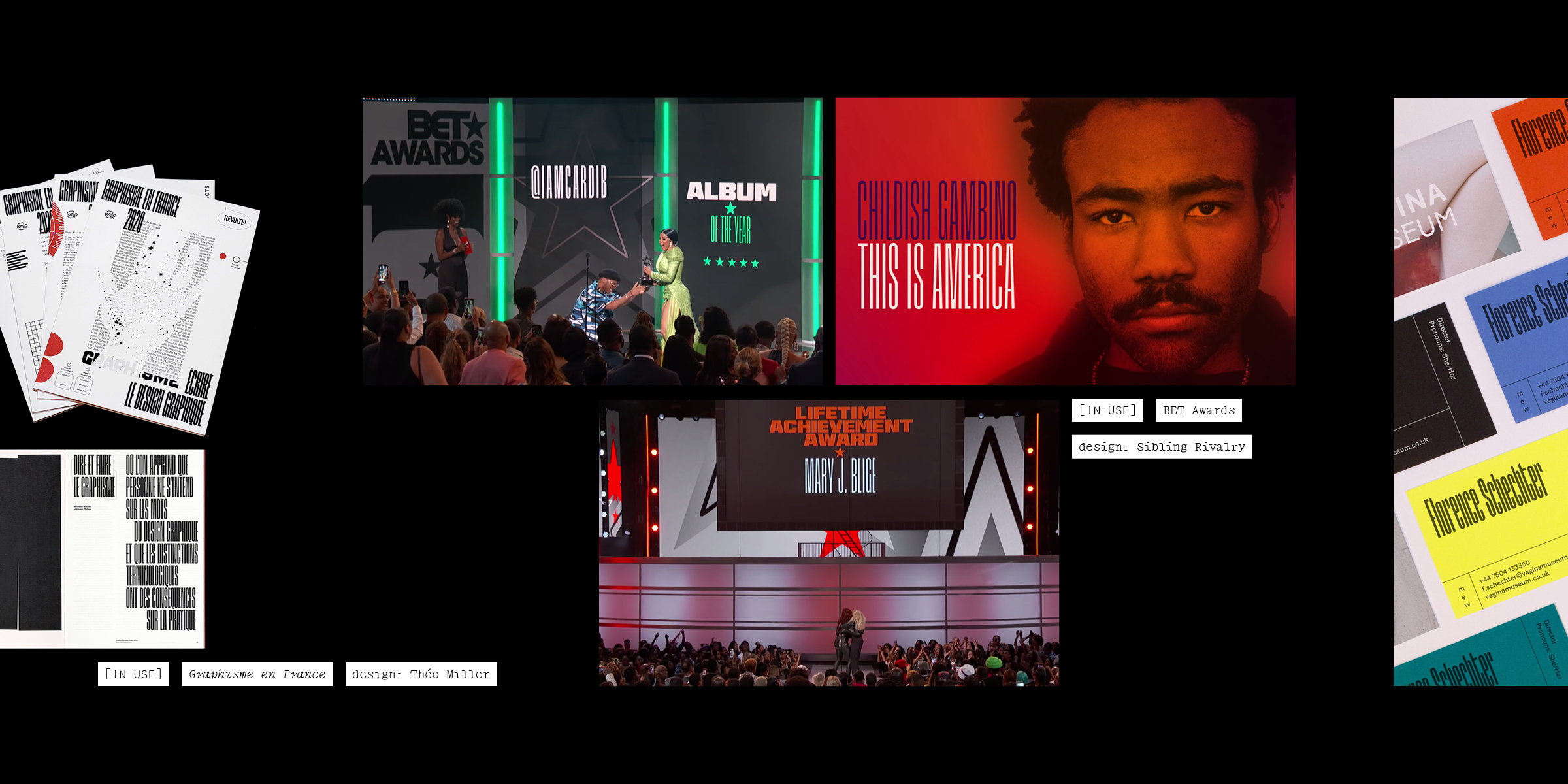
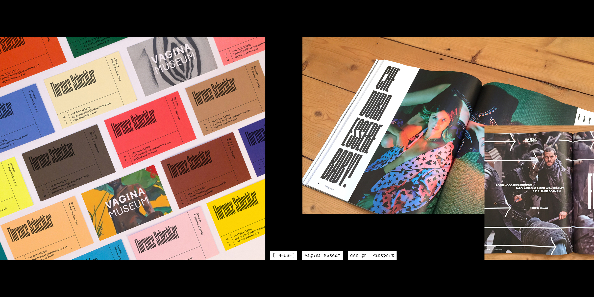
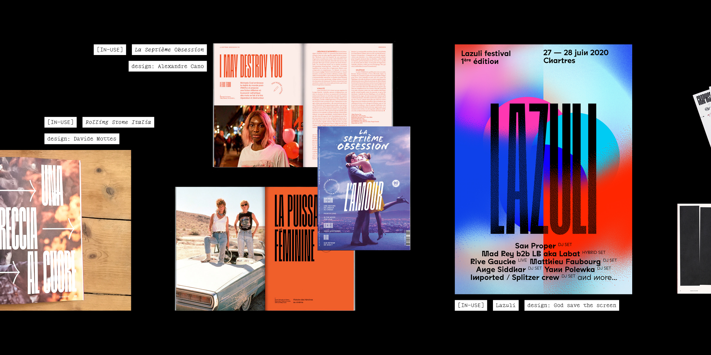
Built like a freestyle over a regular beat, the very condensed Grandmaster explores the border between text and abstraction.
The extremely vertical structure, the regularity of its shapes and counter-shapes make it an almost-kinetic titling typeface, perfect for any incisive editorial layout. If you lose yourself in its rhythm you can almost hear it: cutting, scratching, mixing.
—
Design: Lucas Descroix
Select a license
⤓ Read Plain Form’s EULASelect bundles
Select individual styles
Please select some licenses and styles