'%3e%3crect%20x='45.5'%20y='27.5'%20rx='4.5'%20ry='4.5'%20width='9'%20height='9'%20fill='%23929292'%3e%3canimate%20attributeName='opacity'%20values='1;0'%20keyTimes='0;1'%20dur='0.9615384615384615s'%20begin='-0.8547008547008548s'%20repeatCount='indefinite'%3e%3c/animate%3e%3c/rect%3e%3c/g%3e%3cg%20transform='rotate(40%2050%2050)'%3e%3crect%20x='45.5'%20y='27.5'%20rx='4.5'%20ry='4.5'%20width='9'%20height='9'%20fill='%23929292'%3e%3canimate%20attributeName='opacity'%20values='1;0'%20keyTimes='0;1'%20dur='0.9615384615384615s'%20begin='-0.7478632478632479s'%20repeatCount='indefinite'%3e%3c/animate%3e%3c/rect%3e%3c/g%3e%3cg%20transform='rotate(80%2050%2050)'%3e%3crect%20x='45.5'%20y='27.5'%20rx='4.5'%20ry='4.5'%20width='9'%20height='9'%20fill='%23929292'%3e%3canimate%20attributeName='opacity'%20values='1;0'%20keyTimes='0;1'%20dur='0.9615384615384615s'%20begin='-0.6410256410256411s'%20repeatCount='indefinite'%3e%3c/animate%3e%3c/rect%3e%3c/g%3e%3cg%20transform='rotate(120%2050%2050)'%3e%3crect%20x='45.5'%20y='27.5'%20rx='4.5'%20ry='4.5'%20width='9'%20height='9'%20fill='%23929292'%3e%3canimate%20attributeName='opacity'%20values='1;0'%20keyTimes='0;1'%20dur='0.9615384615384615s'%20begin='-0.5341880341880342s'%20repeatCount='indefinite'%3e%3c/animate%3e%3c/rect%3e%3c/g%3e%3cg%20transform='rotate(160%2050%2050)'%3e%3crect%20x='45.5'%20y='27.5'%20rx='4.5'%20ry='4.5'%20width='9'%20height='9'%20fill='%23929292'%3e%3canimate%20attributeName='opacity'%20values='1;0'%20keyTimes='0;1'%20dur='0.9615384615384615s'%20begin='-0.4273504273504274s'%20repeatCount='indefinite'%3e%3c/animate%3e%3c/rect%3e%3c/g%3e%3cg%20transform='rotate(200%2050%2050)'%3e%3crect%20x='45.5'%20y='27.5'%20rx='4.5'%20ry='4.5'%20width='9'%20height='9'%20fill='%23929292'%3e%3canimate%20attributeName='opacity'%20values='1;0'%20keyTimes='0;1'%20dur='0.9615384615384615s'%20begin='-0.32051282051282054s'%20repeatCount='indefinite'%3e%3c/animate%3e%3c/rect%3e%3c/g%3e%3cg%20transform='rotate(240%2050%2050)'%3e%3crect%20x='45.5'%20y='27.5'%20rx='4.5'%20ry='4.5'%20width='9'%20height='9'%20fill='%23929292'%3e%3canimate%20attributeName='opacity'%20values='1;0'%20keyTimes='0;1'%20dur='0.9615384615384615s'%20begin='-0.2136752136752137s'%20repeatCount='indefinite'%3e%3c/animate%3e%3c/rect%3e%3c/g%3e%3cg%20transform='rotate(280%2050%2050)'%3e%3crect%20x='45.5'%20y='27.5'%20rx='4.5'%20ry='4.5'%20width='9'%20height='9'%20fill='%23929292'%3e%3canimate%20attributeName='opacity'%20values='1;0'%20keyTimes='0;1'%20dur='0.9615384615384615s'%20begin='-0.10683760683760685s'%20repeatCount='indefinite'%3e%3c/animate%3e%3c/rect%3e%3c/g%3e%3cg%20transform='rotate(320%2050%2050)'%3e%3crect%20x='45.5'%20y='27.5'%20rx='4.5'%20ry='4.5'%20width='9'%20height='9'%20fill='%23929292'%3e%3canimate%20attributeName='opacity'%20values='1;0'%20keyTimes='0;1'%20dur='0.9615384615384615s'%20begin='0s'%20repeatCount='indefinite'%3e%3c/animate%3e%3c/rect%3e%3c/g%3e%3c!--%20[ldio]%20generated%20by%20https://loading.io/%20--%3e%3c/svg%3e)
Item 1 of 3
- Foundry:
- Plain Form
- Released:
- January 30, 2025
- Styles:
- 7
- Category:
- sans-serif, slab
- Tone:
- formal
- Use size:
- large, medium
- Width:
- narrow
- Weight:
- light, regular, bold
- Contrast:
- low
- Other:
- italic
- Download:
- ⤓ Trials⤓ End User License Agreement⤓ PDF Specimen
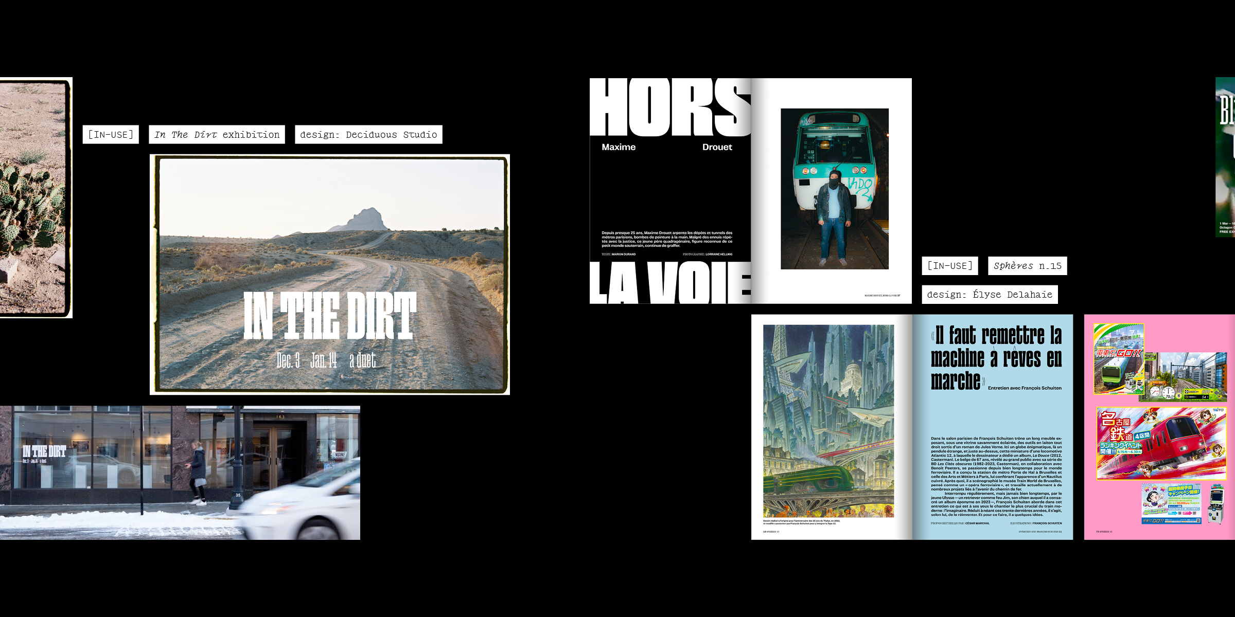
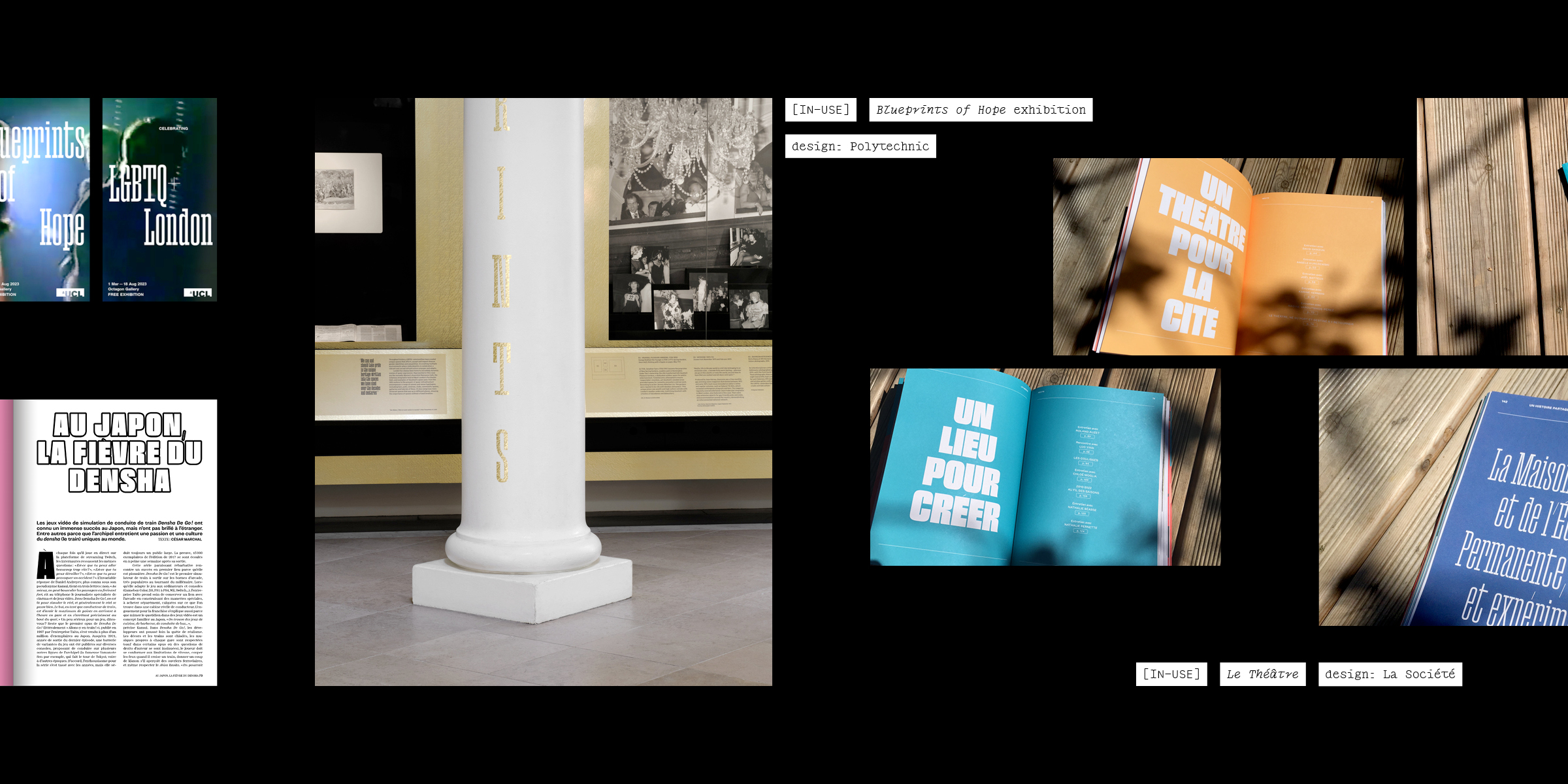
About the typeface
Paraiso is a condensed display typeface with a constructed feel. Although influenced by 19th and early-20th century wood faces, Paraiso’s design is a fantasised reconstruction, straying away from nostalgia and precise historical references. Evoking a set of building cubes, this display typeface finds warmth in the regularity and somewhat comforting tightness of its rhythm.
The Paraiso family is coherent but not linear. It was designed as a limited but versatile palette for striking headlines or poster layouts, its blocky letterforms naturally calling for compact leading and big sizes.
—
Design: Lucas Descroix
Select a license
⤓ Read Plain Form’s EULASelect bundles
Select individual styles
Please select some licenses and styles